Ein neues Projekt muss her. Diesmal geht’s um ein persönliches Dashboard/Startseite, ähnlich wie Momentum oder Hero Panel.
Außer unendlich vielen Ideen und einem frisch aufgesetzten GitHub Repository ist noch nicht viel passiert. In der README habe ich meine Motivation, Ideen und einen groben Plan aufgeschrieben.
Angelehnt an die anderen Tagebuch-Threads soll die Entwicklung von Anfang an öffentlich stattfinden. Das eigentliche Tagebuch ist Teil des Repositories, ich werde den Stand aber auch hier (re-)posten.
2019-03-14
The journey begins
With zero practical TypeScript experience, I’ve had some issues setting up the project, despite using a boilerplate. To get started, I’ve migrated three common JS components from my other app (button, link, icon). I’ve checked some best practices and popular Typescript/React projects, trying to do it the right way™ (e.g. correct types).
I’m really looking forward to experiencing the praised improvement over vanilla JavaScript. My IDE of choice, IntelliJ IDEA, supports TypeScript types for popular projects, so I’ve already got a good IntelliSense even without TypeScript .
The CI pipeline is on and the project is already live (not much is going on, though).
I had to make a decision: what responsive behavior should the dashboard grid follow? There are multiple approaches:
Hero Panel uses pixel-perfect sizings and breaks at 700px into 1x1 widgets. This makes the widgets always look good, as they are fixed-sized. However, the content is simply cut above the breakpoint if it does not fit into the viewport. Also, I prefer seeing more content than a 1x1 widget in mobile view.
Use a masonry layout. This approach makes sure to place all widgets optimally at all breakpoints. This is great for content where the order doesn’t matter. However, on a dashboard I don’t want my widgets to move around auto-magically.
Let the user define the layout for each breakpoint. Meh, too much work for the user.
Make the widgets fluid and break into a single column at 767px (example). Also add a max width to prevent over-stretching the content.
I think that #4 is the best trade-off.
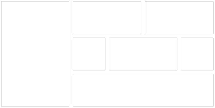
I’ve implemented a simple Dashboard using CSS Grid. The user may define the number of columns and rows and assign a relative width and height for each widget. In the future, this should be configurable within the UI (drag and drop), but for a MVP this is enough.
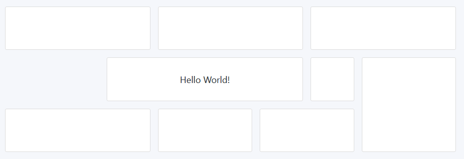
I’ve implemented the first, very basic widget: Text Widget. It just displays fixed text, nothing fancy. Maybe it can be extended to support some basic formatting options in the future.
Most work happened under the hood. I’ve cleaned up the code and tried to establish a good framework to build upon.
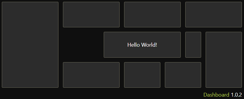
Now there’s support for color themes! I’ve used CSS variables, so it’s easy to switch values at runtime (try out the preview button). There’s also a new shiny favicon, based on Font Awesome 5. Finally, I’ve introduced React’s error boundaries so the app doesn’t crash if a single widget throws any error.
War ich froh als ich damals var und calc in css entdeckt hatte. Vor allem wie einfach damit themes möglich sind. In scss hab ich sowas immer eher schlecht als recht umgesetzt bekommen. Die CSS Variablen haben da schon nen netten Vorteil dadurch dass die von Natur aus cascadierend
Auf Arbeit müssen wir IE11 unterstützen, deswegen hatte ich bisher noch keine CSS Variablen eingesetzt. Privat achte ich auch einigermaßen auf die Browserabdeckung, aber die Alternativen für dynamische Themes waren einfach zu bescheiden.
Vor allem was cool ist, ist das du einfach abhängig von einem State Werte überschreiben kannst. Hab es mir gerade sehr einfach gemacht.
Ich hab den tollen animierten Border vom Material-Ui nachgebaut (also im Prinzip eine komponente die von 0% breite auf 100% breite wächst und einen Border hat). Jetzt wollte ich, dass der die selbe Farbe wie die textfarbe hat. Diese verändert sich aber z.b. bei Hover. Also definiere ich an der Stelle einfach die Textfarbe neu:
I haven’t made much functional progress in the last month as I’ve been mainly working on my other project: Tip of the Day. It is relevant to the dashboard, though, as I wish to connect both projects. The idea is to have a widget which displays a random tip every day (e.g. “country of the day”). I’ve also made some progress under the hood and made the text widget editable (the content is not stored yet, though).
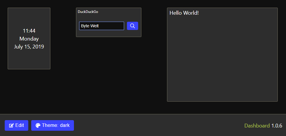
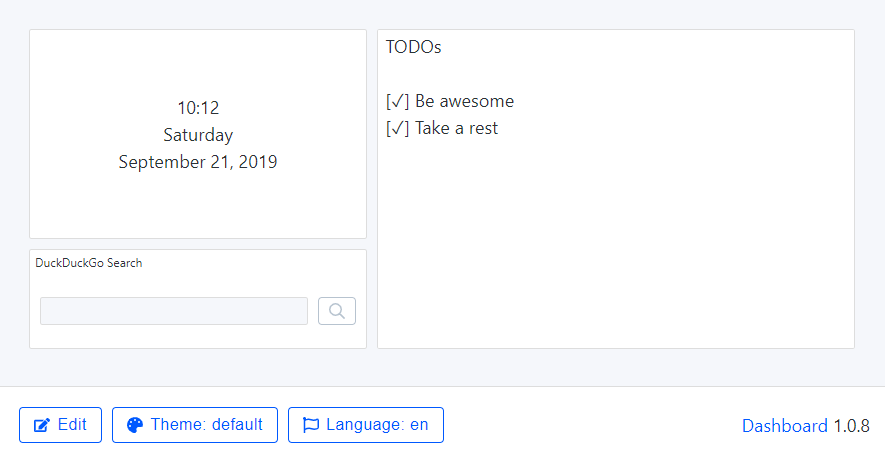
There is a new widget for showing the current date and time. Additionally, the state is now persisted across the sessions. Under the hood I’ve added redux-observable to manage side effects and I’ve played around with the new React Hooks.
The first step for GUI-based dashboard customization is done: the widgets are now draggable/resizeable. The widget selection is still fixed, though, so I should implement a widget drawer soon.
I’ve also added a new Search widget. Right now the DuckDuckGo search engine is hard-coded, but in the future there will be a list of pre-defined providers and also the possibility to define a custom website.
Finally, I’ve replaced most of my (S)CSS files with a Functional CSS approach. I’ve used Tailwind CSS, one of the most popular utility-first CSS frameworks. I really enjoy it so far
Notice: The state data is stored in the Local Storage, so you might have to clear it if you have opened the website in the past. This won’t be necessary when the project is out of the work-in-progress state of course.
The announced widget drawer is now implemented. This means, all available widgets (date/time, notes, web search) can be placed onto the dashboard and moved/resized within the UI. Removing the widgets is not yet possible, though.
I’ve added multi-language support. Currently English (default) and German are available. I’ve used i18next to compare it to the more popular react-intl which I’m using at work. So far it’s really nice to use.
I’ve also included Storybook for development, a tool to preview UI components. It helped me already to find and fix some small issues.
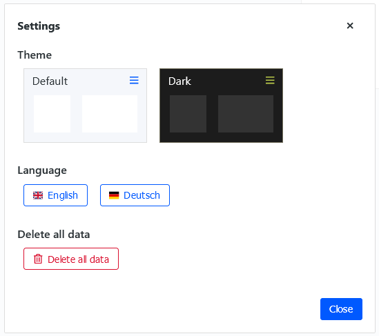
Every widget can now be removed from the Dashboard. The last missing part of personalization is a settings dialog, so the user can select another search engine for example.
As I had previously copied the Button component from my other projecs, it did not follow the new CSS variable approach to support different themes. The migration was not as trivial, because I could not use the darken and transparentize SCSS functions with CSS variables anymore. Converting the colors into HSL made the transition easier, though. Now Dashboard support different Button colors for the light and dark themes.
Now that travis-ci.com supports open source projects, I’ve migrated all my projects from travis-ci.org. The GitHub integration automatically checks each commit and PR and submits a report directly on GitHub. I’ve also played around with the new GitHub Actions after getting into the Beta. While it’s quite powerful, I still prefer Travis CI and GitLab CI due to the native yarn support.
The personalization concept is fully implemented: every widget can now define a configuration modal. The first (and currently only) widget is the Search widget, where the user is able to define the title and URL pattern. A list of predefined search engines is also available for a quicker access.
When the widgets are initially loaded, a loading spinner was being shown before. I have replaced this loading indicator with skeleton loading for a nicer look.
Now I can concentrate on implementing more widgets to make this project actually useful.
To declutter the main view, I have moved all control buttons into a (hamburger) menu and a settings modal. I’ve also improved the theme selection, so a preview for each theme is displayed. Something similar will be available for the language selection in the future.
Until now, the available widgets and their configurability were hard coded. With more widgets and widget properties (like initial options) coming, a dynamic way to list the widgets and their properties was needed. Now creating a new widget means just using the file generator ( yarn generate ) followed by a script to re-scan the available widgets ( yarn scan-widgets ).
One of the first components was Date&Time. I had overengineered it by implementing a global heartbeat and putting the tick value in the global state. I thought this would make implementing further interval components (e.g. countdown) and (re-)fetching data easier. While implementing the first remote data-driven widget it turned out not to be the best idea after all. Hence, I have removed the global heartbeat and replaced it with local state.
A new button in the settings modal makes it possible to delete all user data. This is especially useful in the early stage of development, as the main data schema may still change regularly.
Documentation
The project documentation is now hosted on my own domain. The GitHub Markdown preview is nice (and can still be used), but a separate site has some advantages:
It is easier to view and navigate (especially for non-tech people).
It makes it possible to maintain the project journal as a blog (with RSS support!).
It looks much better.
There are so many documentation platforms and I’ve spent way too much time finding the right one. Docusaurus seemed like the best solution, even with first-class support for a blog. But the configuration is tricky and the folder structure inconvenient. Some other static site generators did not support simple relative links, like [link](docs/README.md). In the end, I went with VuePress, which offers almost everything that I need out of the box. The RSS part is based on an unofficial plugin that I have customized to my needs.
The documentation itself is an ongoing work in progress, especially for the Widget section.
Dependencies
When doing my regular dependency update, I was pleasantly surprised:
redux-starter-kit 1.0 was released. Among the changes, createAction now allows defining custom types, leading to a better TypeScript integration.
react-grid-layout, the library I am using for the dashboard grid, got the first updates since 1.5 years.
Unfortunately, I experienced a strange issue, which crashed the application. The core issue was easy to identify and fix: React props are mutated in react-grid-layout, which is never a good idea. But this code hasn’t changed in a while. So what caused the issue to emerge now? As I have updated a lot of libraries, it took a while to find the responsible library. In the end it was the immer dependency update in redux-starter-kit, which freezes the state, leading to the react-grid-layout bug becoming visible.
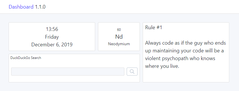
So far, all widgets were fully local, i.e., they did not require any remote data. This makes the possibilities rather limited. I have finally designed the architecture to support fetching remote data, and I have implemented the first widget as an example: Chemical Element of the Day. This widget displays the data from my Tip of the Day project. Other TotD widgets will join the list in the future.
I had to revisit some architectural decisions. First, I have replaced redux-observable with redux-saga. I was hoping to gain some more experience with RxJS (which I did), but it felt too complicated to implement the easiest fetch/success/error flow. I find the procedural way of redux-saga more natural and easier to understand.
Second, I have removed the shared state completely. It was meant as a performance optimization for widgets with shared data, like the new Chemical Elements widget. The drawback was having to handle the state at different places, making the implementation more complicated than necessary. Instead, now every widget has its own (sub-)state. I might implement some request-level caching in the future to prevent fetching the same resource twice.
Other changes
All input fields contain an „X“ button to clear the content. It was tricky to get the rendering and focus right, but it looks good now.
I’ve added a Code of Conduct to the project. While there are no contributions yet, it’s important to create a welcoming and inclusive atmosphere from the beginning.
JetBrains released the Grazie Plugin, and advanced spelling/grammar/styling checker, for all of their IDEs. I have enabled this plugin for Markdown files, and it helped me to solve some minor issues.
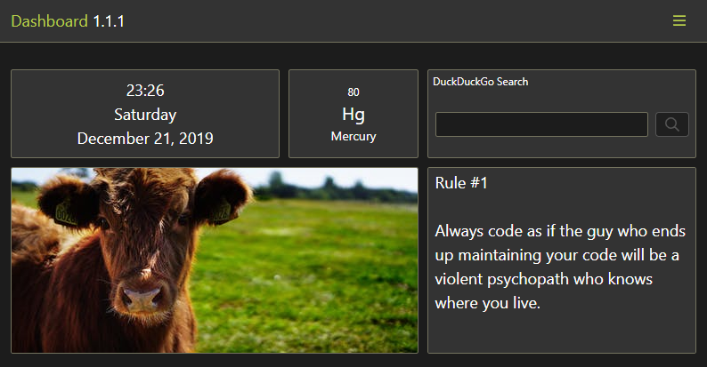
There’s a new widget for displaying images! The URL is configurable in the widget’s settings modal. Nothing fancy, but there’s finally some color on the Dashboard .
I’ve also started working on a more complex widget (spoiler alert: it’s about weather). I’ve done some more refactorings and improvements along the way to make the development easier. This includes extracting some boilerplate code, fixing the saga model and updating/adding file generators. I’ve also enabled GitLab CI, so I get an early feedback before making an official release on GitHub.
Changelog
New widget: Image.
Make Storybook widgets resizeable for improved UI tests.
Include a robots.txt file.
Add new file generators (widget story, widget properties).
Enable GitLab CI.
Update dependencies.
Use an accessible accent color for the documentation.
There is a new widget: Website (Iframe). This makes it possible to include websites or web applications without a designated widget. However, many websites do not allow to render their page in an iframe (via CSP or X-Frame-Options). Personally, I am using this widget to include Todoist and my own Etherpad instance.
Previously, changing a widget setting was reflected immediately, without a way to revert the change. Now, widget settings can be cancelled in the modal. This change does not apply to the general settings modal, yet.
The UI language is now auto-detected. If the browser uses a supported language (currently English and German), it will be used by default. The language can still be changed in the settings modal afterwards.
I’ve also improved the documentation. Among others, I have split the widget documentation into separate files. This will make it possible to link to a widget’s help page directly from the dashboard in the future.


 .
. New widget: Image.
 Make Storybook widgets resizeable for improved UI tests.
 Use an accessible accent color for the documentation.
 Ich bin schon sehr gespannt
  Prevent double vertical scrollbar.
 Refactor the menu into a
  Host
Host